

Find out more: https://community.oracle.com/products/oracleanalytics/categories/training
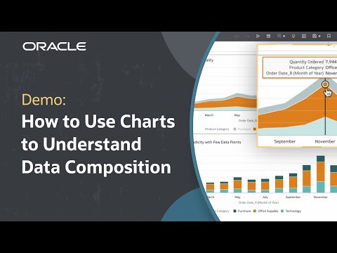
In this tutorial, we’ll learn how to use charts to understand data composition in Oracle Fusion Data Intelligence (FDI). Data composition refers to analyzing how data is distributed over time and by attribute. Choosing the appropriate chart helps decision makers understand patterns and relationships in their data composition. This tutorial reviews pie charts, horizontal stacked bar charts, 100% stacked bar charts, treemap charts, stacked area charts, 100% stacked area charts, and waterfall charts as a way to show data composition over time or by attribute.
Like what you learned about Oracle Fusion Data Intelligence? Subscribe now https://social.ora.cl/60025k87j
Contact FDI Sales – https://social.ora.cl/6003FLUMT
Learn More about Oracle FDI – https://social.ora.cl/6009FLU33
FDI Customer Success Stories – https://social.ora.cl/6002FLU3Q
Follow us here:
LinkedIn: https://social.ora.cl/60035eXuF
X: https://social.ora.cl/6008abVgG
Instagram: https://social.ora.cl/60095eXDN
Facebook: https://social.ora.cl/60065enQp