

Explore a range of training programs in Oracle Analytics designed to boost your skills: https://social.ora.cl/6003fu0pZ
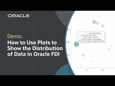
In this tutorial, we’ll learn how to use plots and charts to understand the distribution of data in Oracle Fusion Data Intelligence (FDI). Distribution of data shows how values are spread across categories to identify potential trends, anomalies, and relationships in the data. Depending on the data, there are different visualizations that can best display distribution. This tutorial reviews which plot charts can be used to convey data distribution and how to read them.
Check out detailed instructions on scatter graphs in Oracle Analytics Cloud: https://social.ora.cl/6006fu0kC
Like what you learned about Oracle Fusion Data Intelligence? Subscribe now https://social.ora.cl/60025k87j
Join us at Oracle CloudWorld – https://social.ora.cl/60035eVvJ
Contact FDI Sales – https://social.ora.cl/6003FLUMT
Learn More about Oracle FDI – https://social.ora.cl/6009FLU33
FDI Customer Success Stories – https://social.ora.cl/6002FLU3Q
Follow us here:
LinkedIn: https://social.ora.cl/60035eXuF
X: https://social.ora.cl/6008abVgG
Instagram: https://social.ora.cl/60095eXDN
Facebook: https://social.ora.cl/60065enQp